Packaging
Cloud & Mist Tea
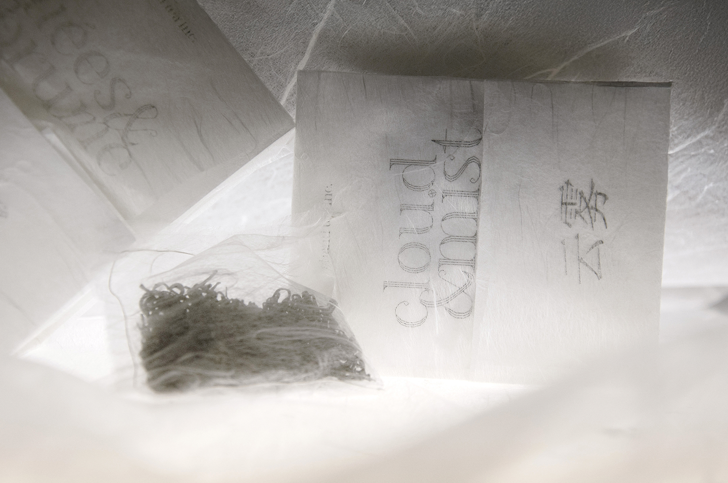
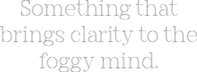
In Chinese, Yun Wu (Clouds & Mists) describes two kinds of condensation that occur in mountainous areas with higher humidity — which provide the perfect conditions for growing quality tea leaves. This variety of green tea is recognized for its mellow flavor and subtle, light notes, invigorating the body and clarifying the mind.
The brief was to create custom packaging for samples that would be distributed in a special demonstration to tea enthusiasts and workers that seek a moment of respite in their busy lives, to promote a premium variety of loose leaf green tea from Zhejiang, China.
Shanti Tea is a Canadian company dedicated to sourcing the finest organic teas, with a commitment to creating high-quality, ethically sourced, and sustainable tea blends that nourish body and mind.
Through market research, I discovered that the commercial market for lower-grade (crushed leaf) teas often resort to direct communication, using obvious codes such as green coloring and naturalistic imagery. For loose leaf teas, abstract approaches and typographic layouts are preferred.
The defined priority was to distance the product from the commercial market by employing storytelling through a typographic and materiality-first approach that would reflect the tea's origins and the sensory connotations of clouds and mist.
![Quote from the packaging: “In the hustle and bustle of daily life, allow for a momentary rest and embark on a journey of distant travel across Asia’s high mountains, with the clouds and mist as your allies [...]”](https://cdn.prod.website-files.com/69ca788fb1a78f5f066d5331/6a147a19ca0b1a41051c69ef_CM_Copywriting_Quote.svg)
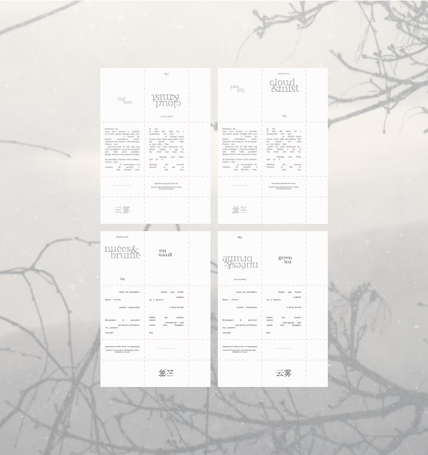

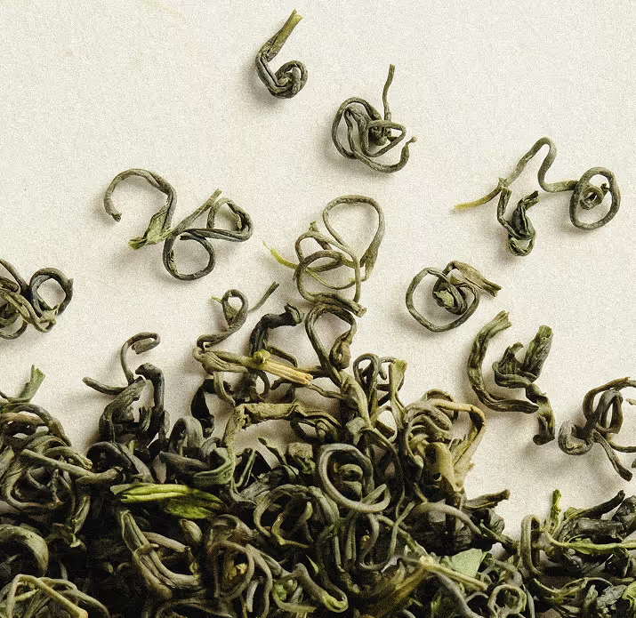
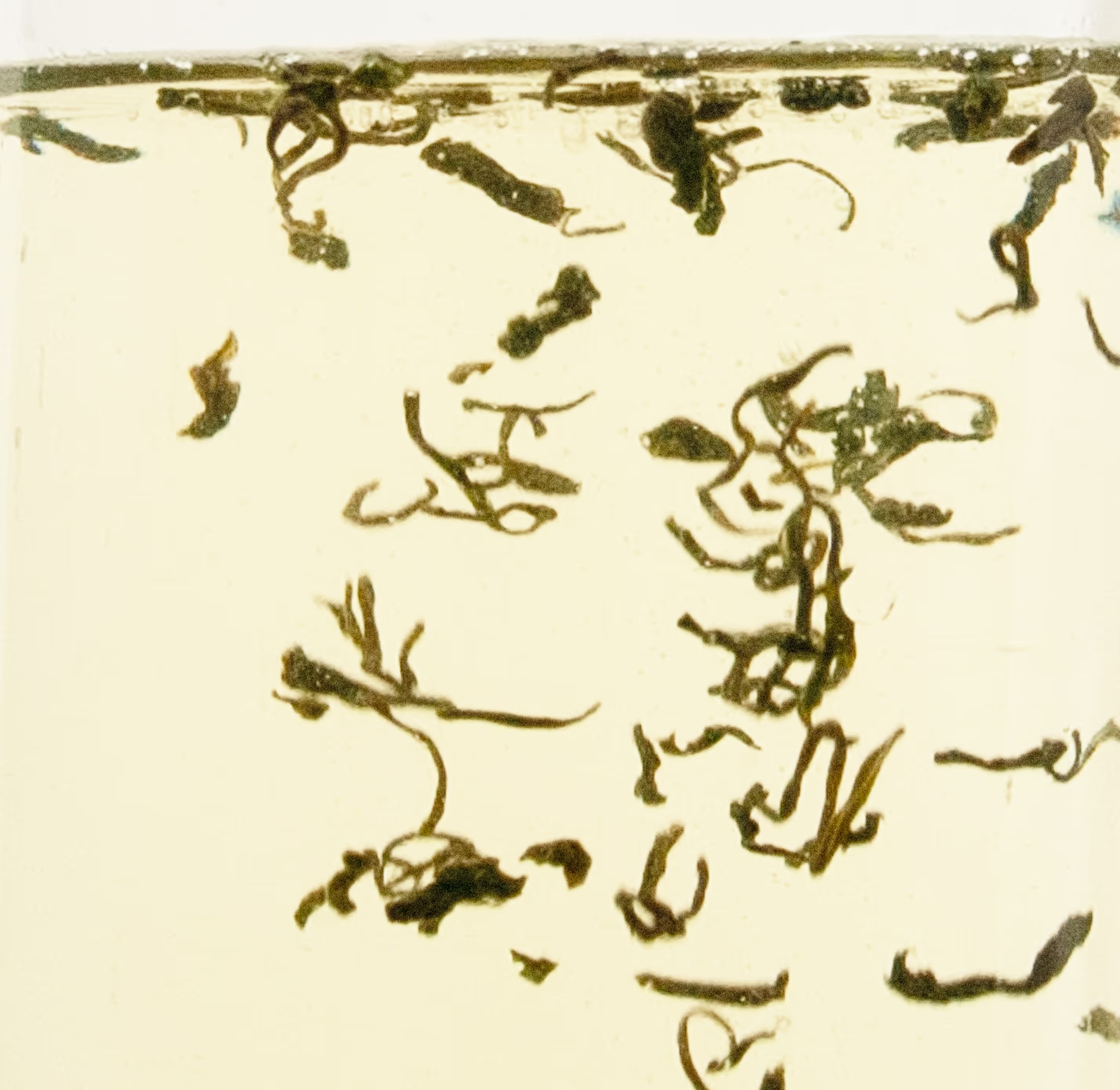
Mad Serif was the perfect typeface for the concept, with its elegant, airy and curly serifs, reminding me of the shape of the tea leaves, which are thin and curly when dried, and bloom slightly as they soak in the water. The outlined style also introduced a sense of spaciousness and lightness.
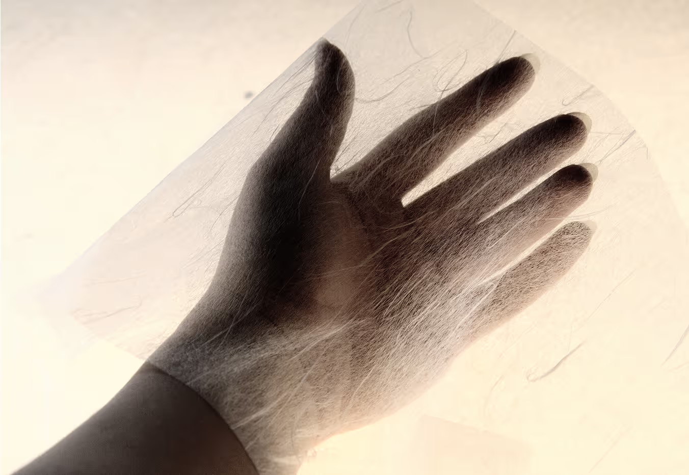
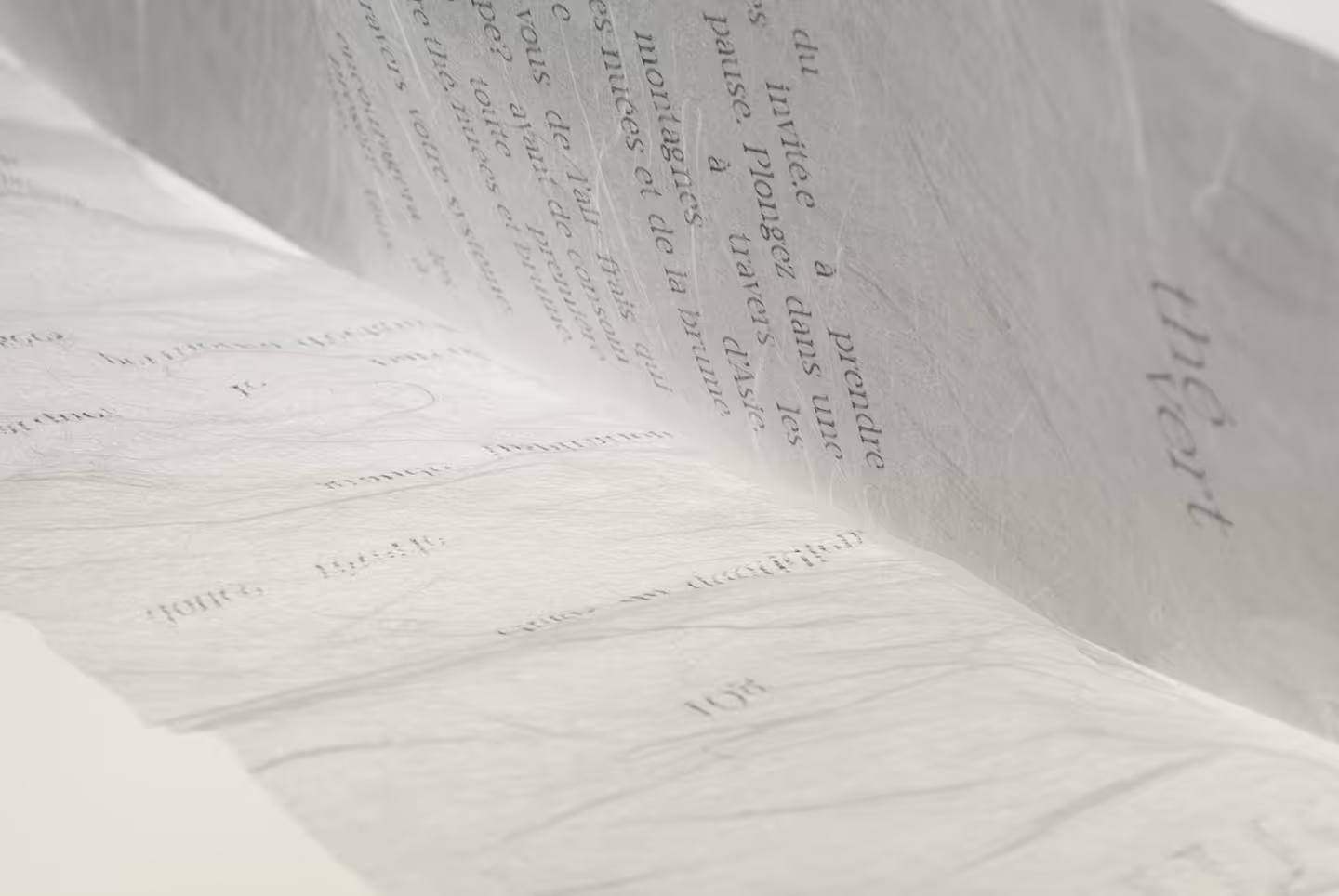
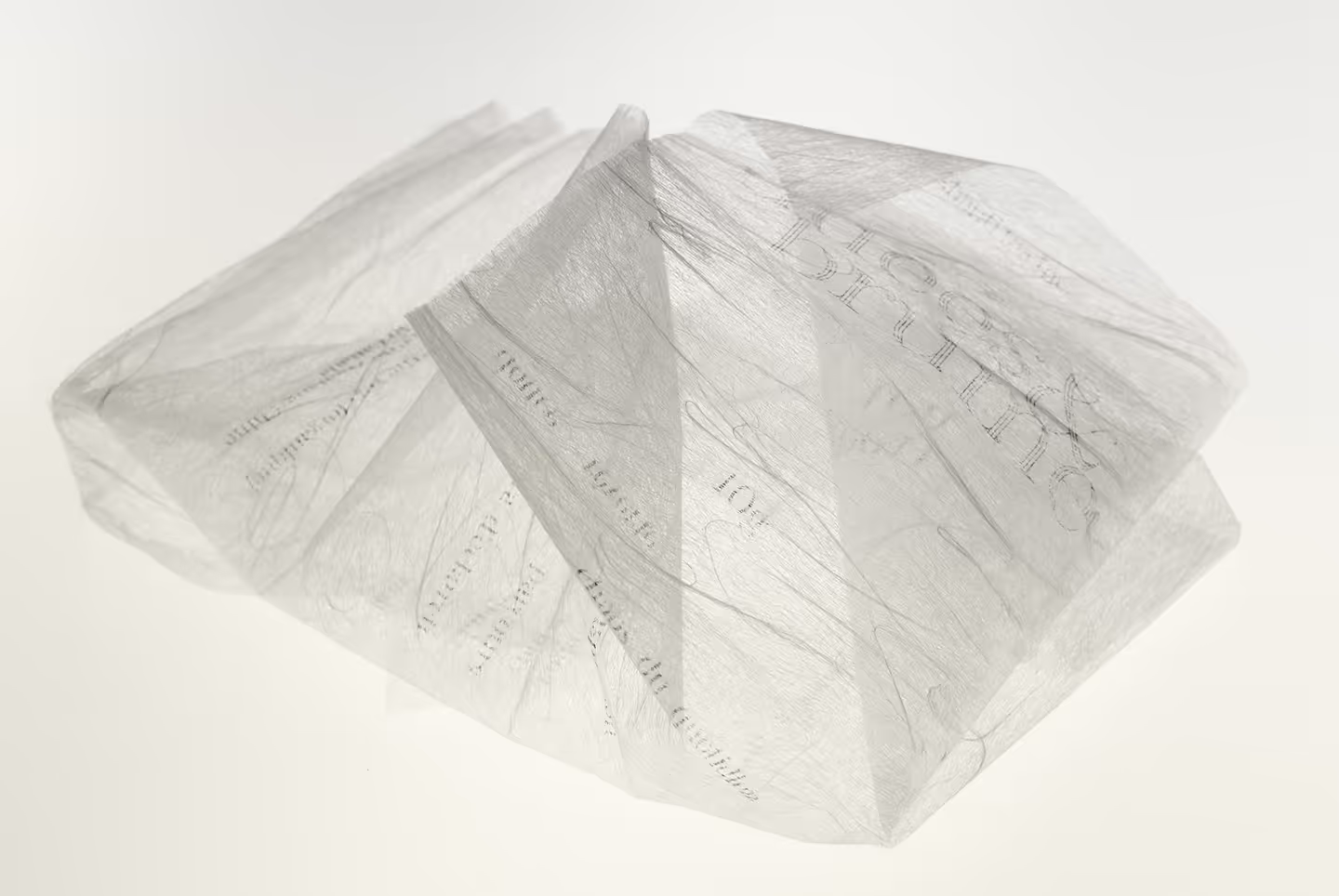
Two weights of Unryu Japanese paper were used to add a luxurious feel to the packaging. The layering of the two creates depth that reflects the landscape of clouds and mist interacting with one another, while the silvery fibers echoed immateriality and the wind element.