Publication
Web Design
Mycophile

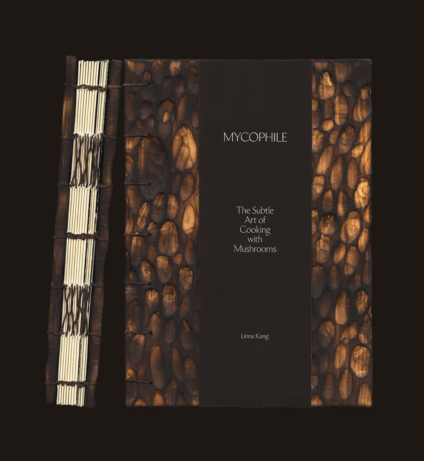
The objective was to create a cookbook centered on foraged and unconventional mushrooms, highlighting the wonders of these rare ingredients. Its aim is to promote sustainable production and to appeal to fine dining chefs, high-level home cooks and mushroom lovers. Foraged mushrooms often cannot be commercially produced, meaning their supply is limited year after year, which drives costs. They are not typically accessible to the average consumer and are seen as luxury ingredients. The intent is to lean into the non-commercial aspect, through an emphasis on craft, luxury codes and an homage to nature, while taking inspiration from mycology.
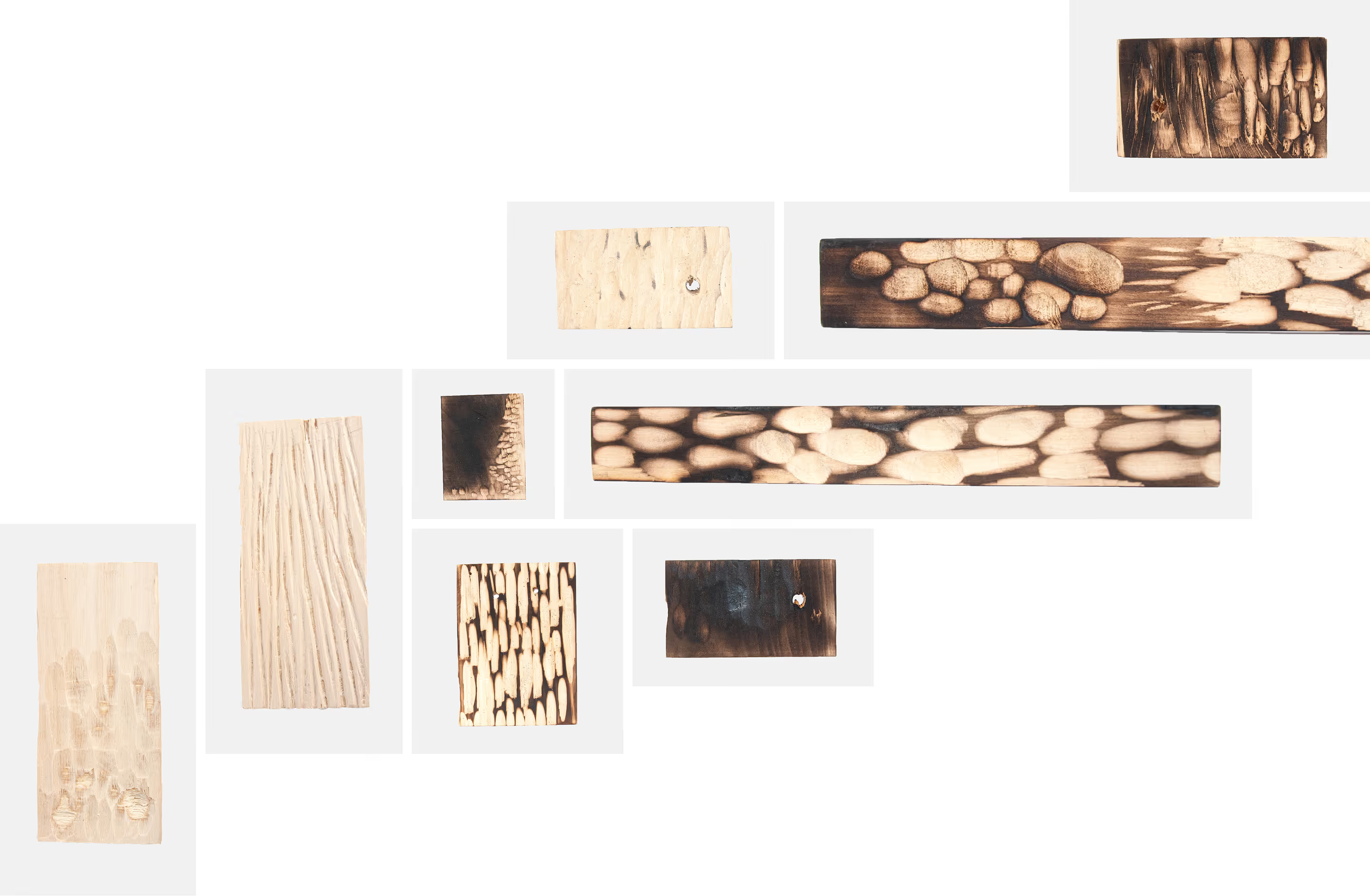
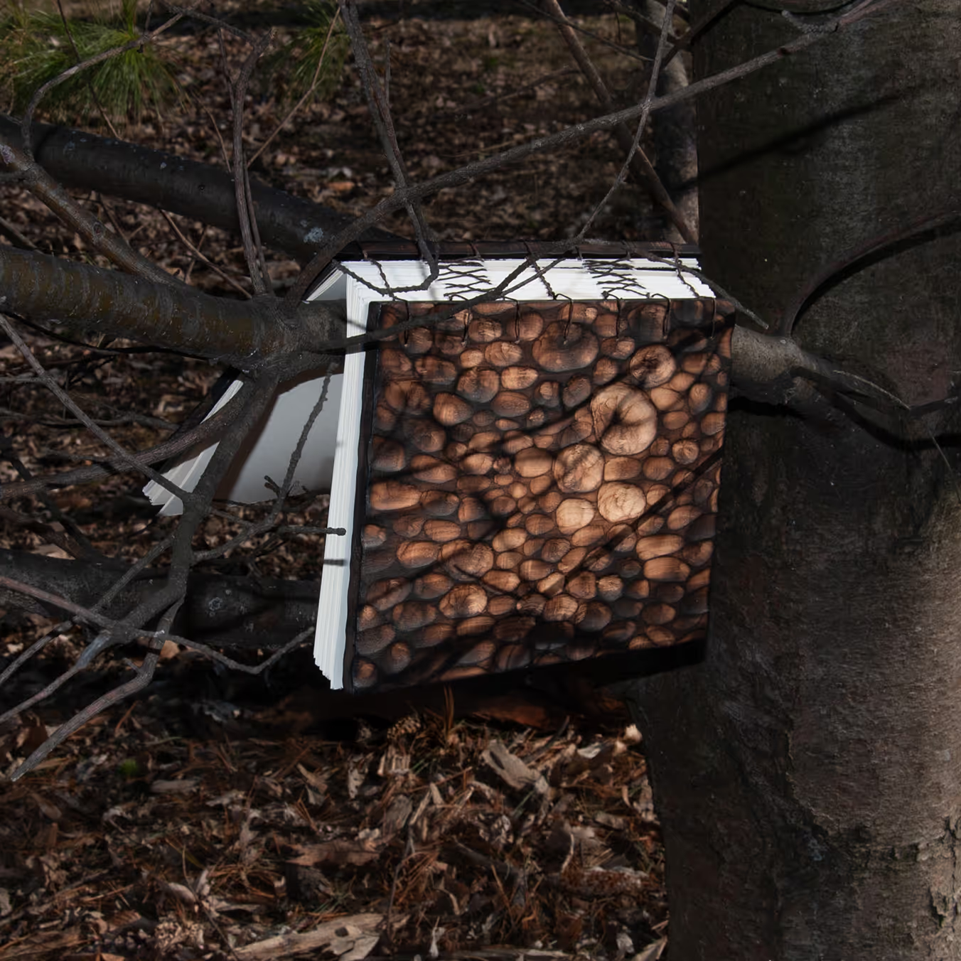
I was particularly driven by the idea of using wood for the covers of the book, as it would instantly evoke the feel of the forest, the natural habitats of these mushrooms. I was also very much inspired by the diversity of textures that mushrooms exhibit. While I was researching, I learned that morels are known to grow after forest fires.
This gave me the idea of using basswood as the primary material, and replicating the beautiful texture of morels by carving. It was very important not to produce any sketch for the final pattern of the covers. I wanted to create freely, with the unpredictability that would come with carving the wood – a similar process to nature itself.
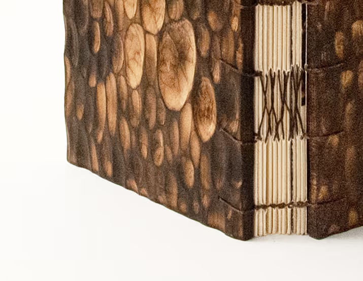

The result is an abstraction of the morel’s texture. Afterwards, I treated the raw wood using fire, which gave natural shading to the wood and linked back to the forest-fire origins of the morel. A satin varnish was used to seal the burnt wood, avoiding smudging.
For the binding, I used coptic stitching combined with french links, to mirror the texture of the mycelium, or underground roots network of mushrooms. This allows the book to lay flat for ease of use while cooking.

The deckling effect of the paper was custom-made in the woodshop using a spindle-sander, adding an organic touch to the fore-edge.

The display typeface, Ceraph from Sharp Type was chosen to reflect a refined elegance, with RM Neue to pair it for the body copy, ensuring legibility. As for the art direction, due to lack of access to photography and food styling services, generative AI was used as a way to visualize the mood. A special attention was given to the interaction of light and shadow, inspired by the phenomenon of light passing through leaves in the forest.
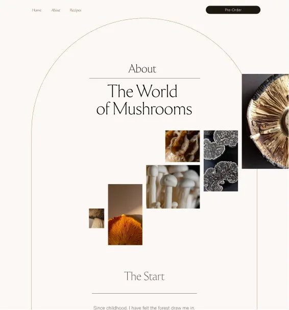

One of the keys to the selected image treatment and art direction for the book design and the promotional landing page was the concept of “spreading,” or growth, characterized by the expressive use of the grid when using an array of images.