Wayfinding

Rebranding

Stackt Market
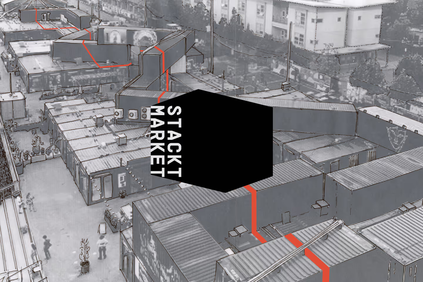
Stackt logo overlaid on top of a wayfinding image from the market.

Context

With Stackt's planned future expansion to Calgary, Vancouver and other parts of Canada, the brand would benefit from a refresh to ensure consistency in its brand identity across all sites and applications.

This rebrand returns to the market's original architectural details using construction aesthetics as a metaphor for how Stackt serves as a foundation for both business and community to thrive. Destined for a broad range of customers, from the general public, to families, friends and every one in between, the brand's philosophy is rooted in accessibility, entrepreneurship and community.

Stackt Market

Stackt Market merges community and commerce in its unconventional retail business, its main location consisting of 120 shipping containers. The original Toronto flagship is divided in multiple areas suited for various spheres of living; from a basketball court, to a dog park, community garden, art galleries, store popups and regularly occurring events, visitors always have something new to discover.

Situated next to the Toronto railways, the market was initially designed to be short-lived. Thanks to its tremendous success, Stackt has recently renewed its lease with the city and is here to stay for many years to come!
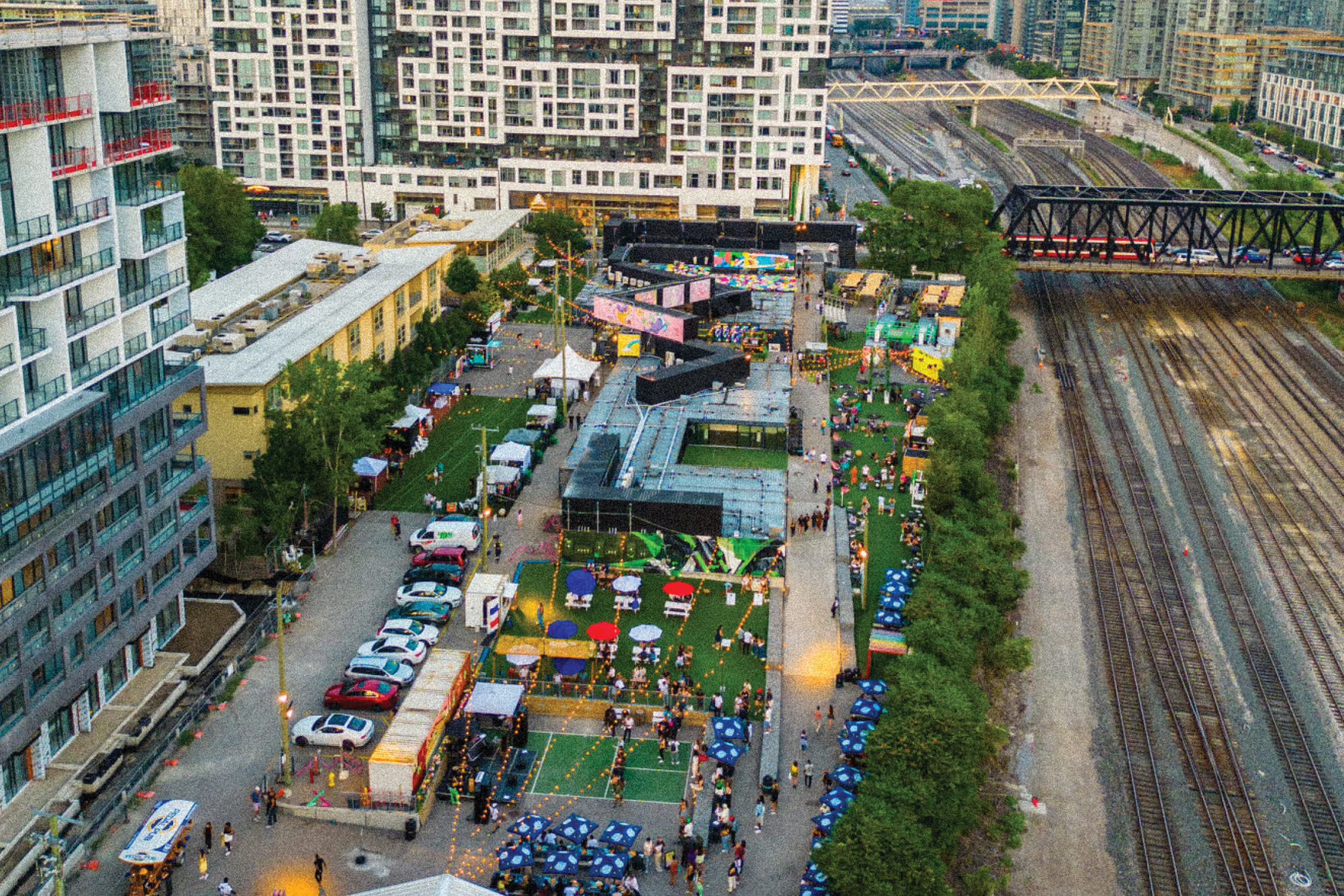
Bird's eye view of the market. Original photo credit is from Stackt Market.
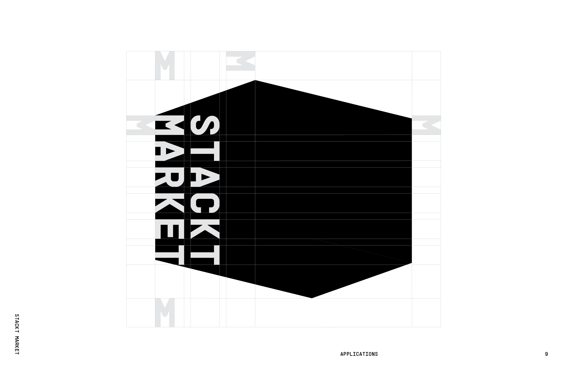
Stackt Market primary logo grid.
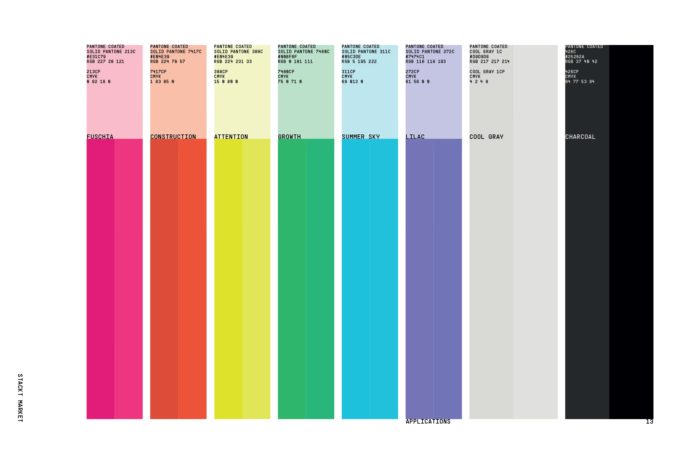
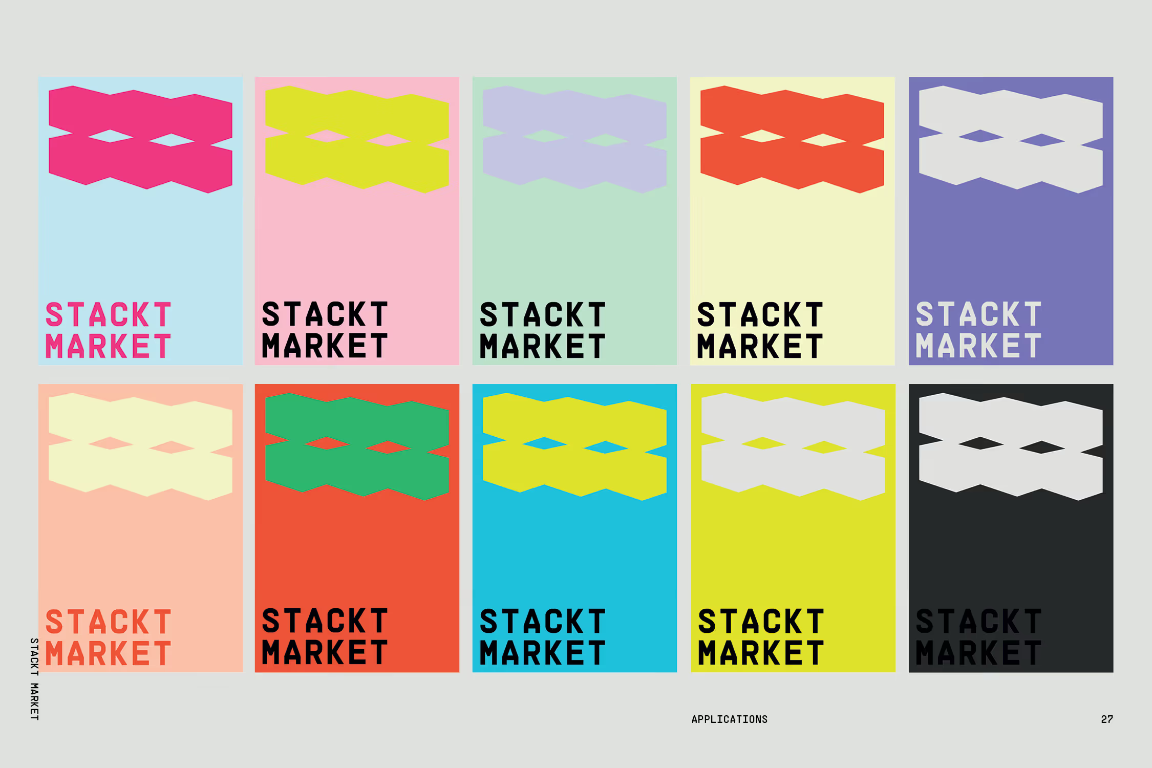
Stackt market color palette; fuschia pink, construction orange, attention yellow, green growth, summer sky blue, lilac, cool gray and charcoal.
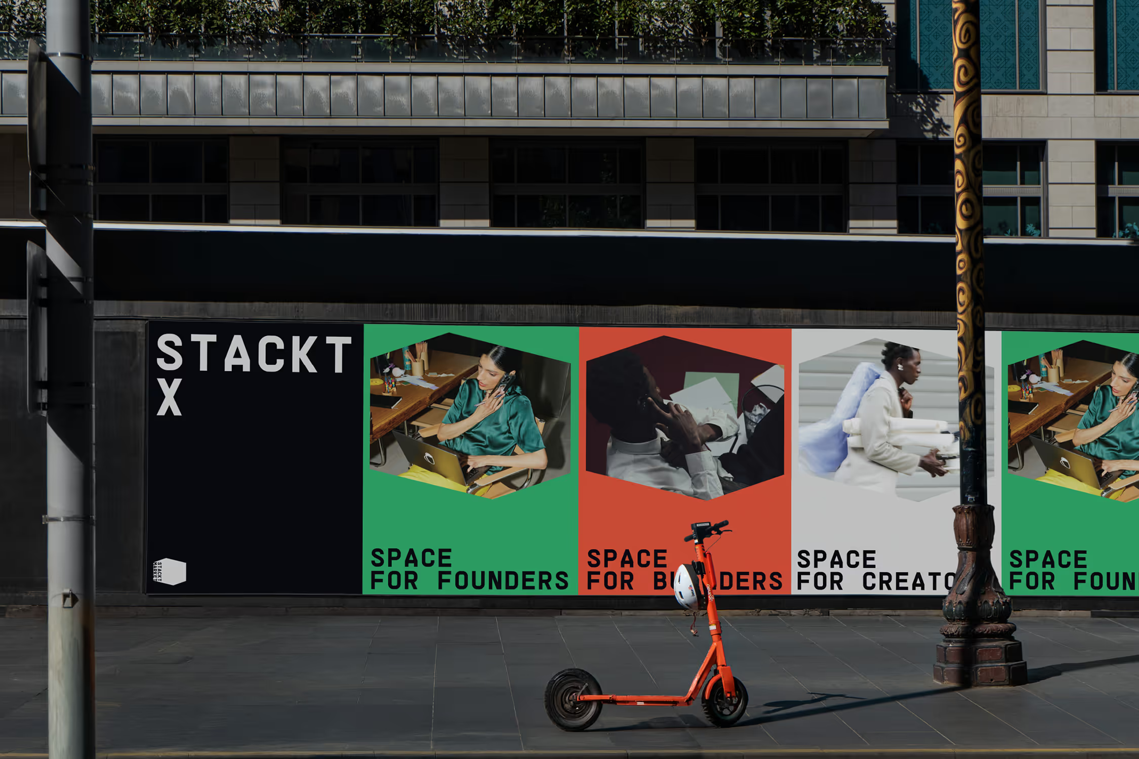
StacktX sub-brand to help entrepreneurs and creatives with new retail ventures.

StacktX is an initiative by Stackt Market and functions as an incubator for new entrepreneurs and creatives, who may apply for grants and obtain free or flexible leases at its locations. It facilitates business owners to test new ventures in Stackt's low stakes program.

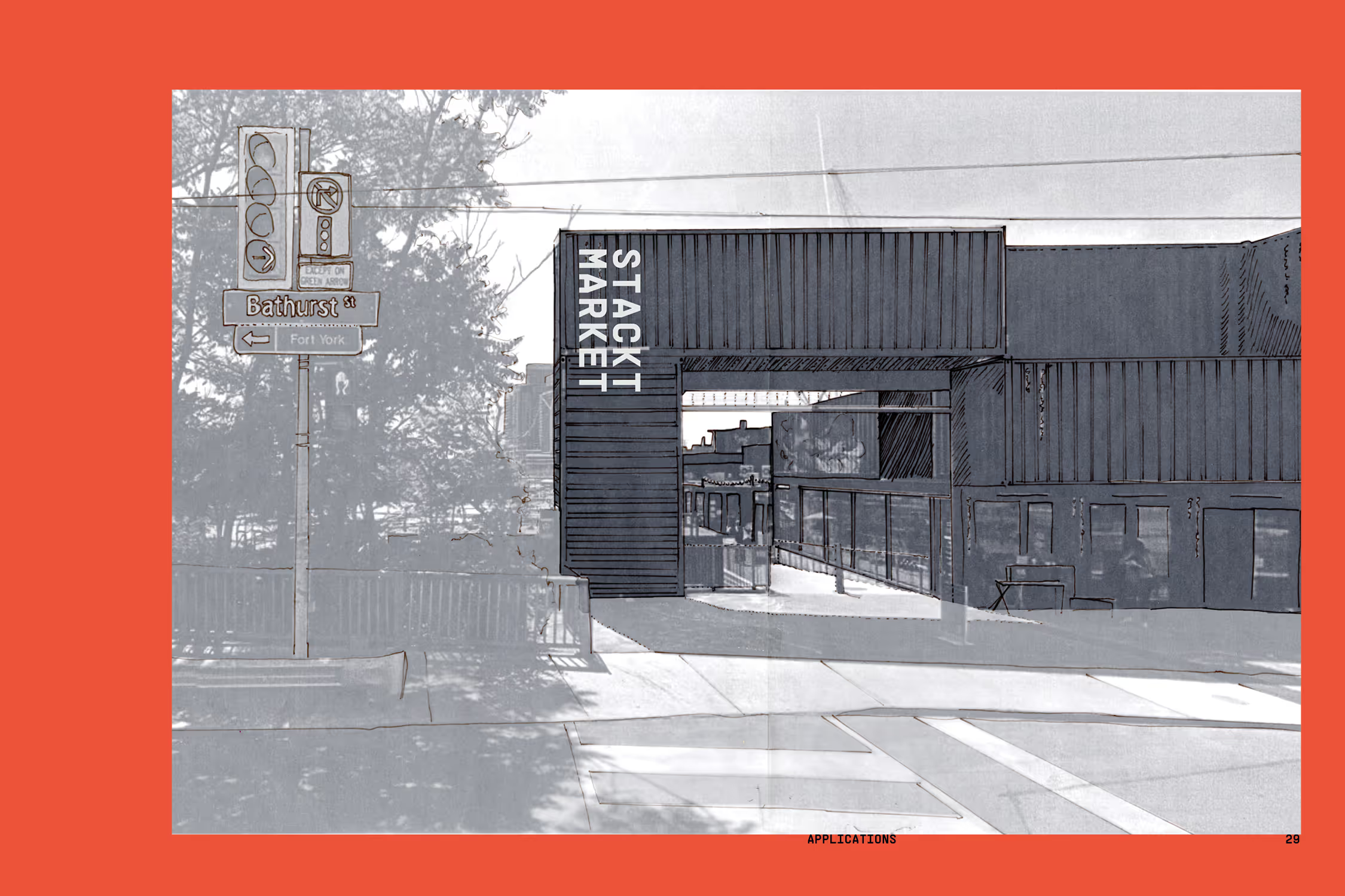
Sign design at the side of the Toronto market.
Sign design at the front of the Toronto market.
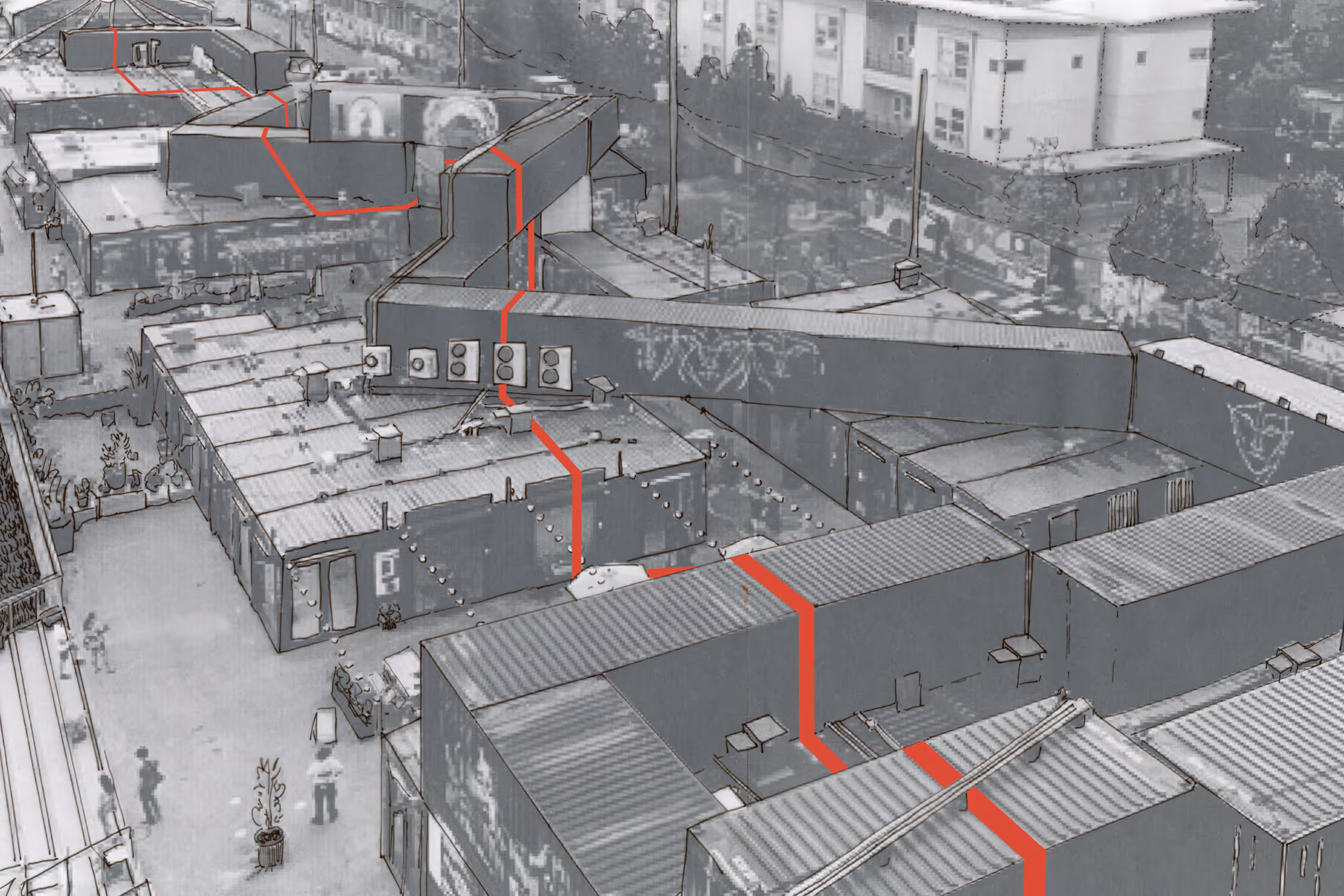
A painted line runs through the entire market, symbolizing unity and connection.
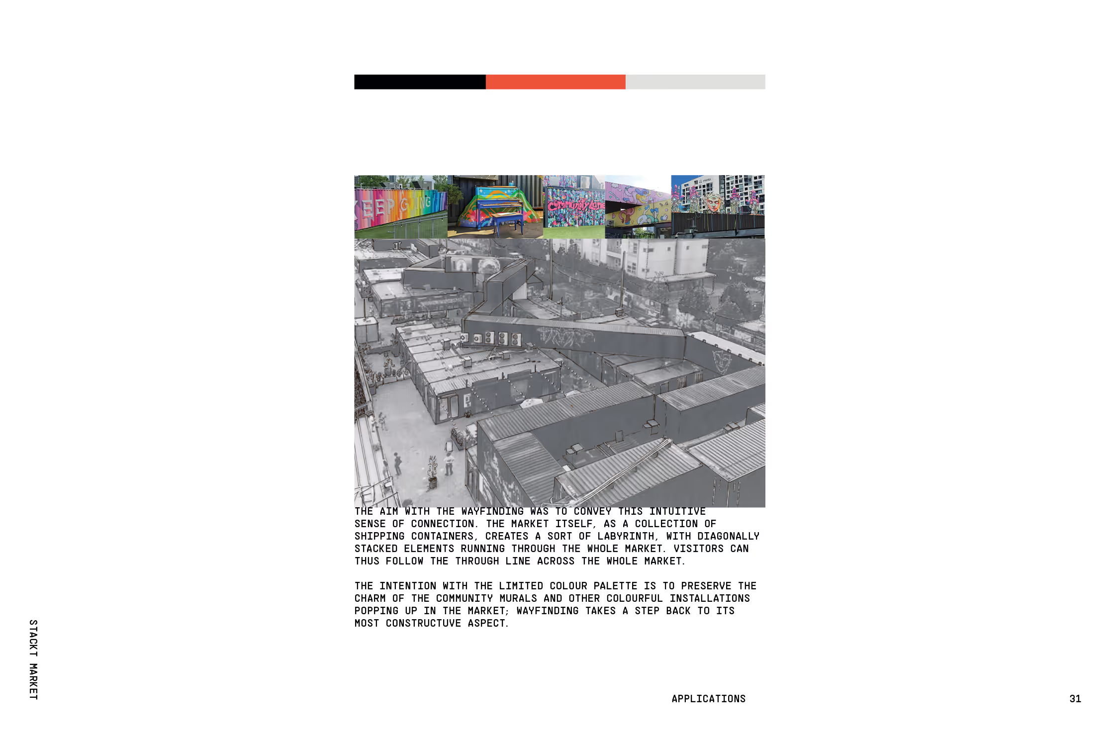
Rationale for the wayfinding with pictures of the murals currently at Stackt: 
The aim with the wayfinding was to convey this intuitive sense of connection. The market itself, as a collection of shipping containers, creates a sort of labyrinth, with diagonally stacked elements running through the whole market. Visitors can thus follow the through line across the whole market.

The intention with the limited colour palette is to preserve the charm of the community murals and other colourful installations popping up in the market; wayfinding takes a step back to its most constructive aspect.
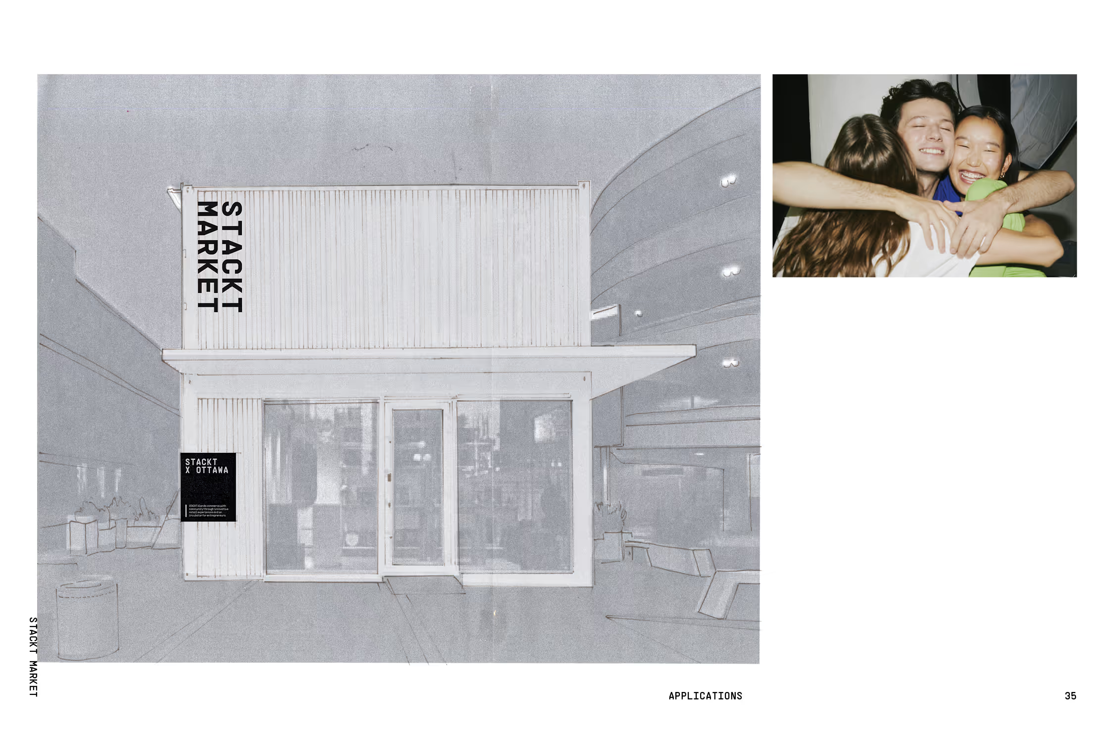
Store popups design for other cities.
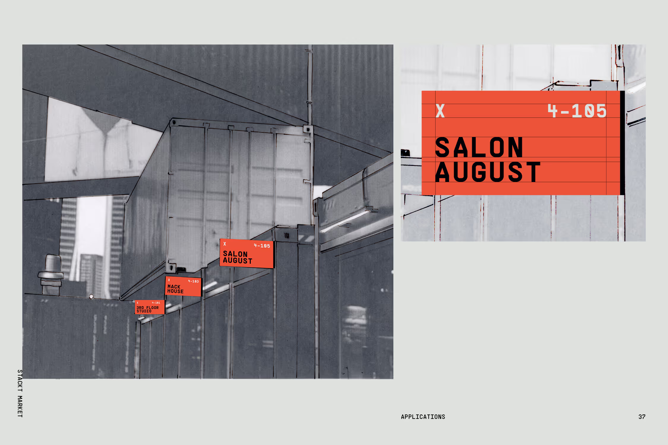
Wayfinding system for the storefronts in the market.
Agustin Farias photography, of two men in suits walking in motion.
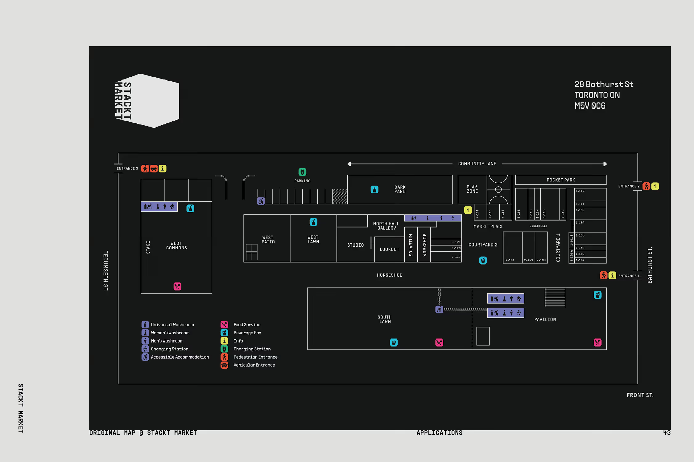
Map redesign of Stackt Market.
Iconography system based on the primary typography, using angular styling with a couple softened curves.
Franco Dupuy worm's eye view photograph of a group of young adults with a basketball looking down into the camera.
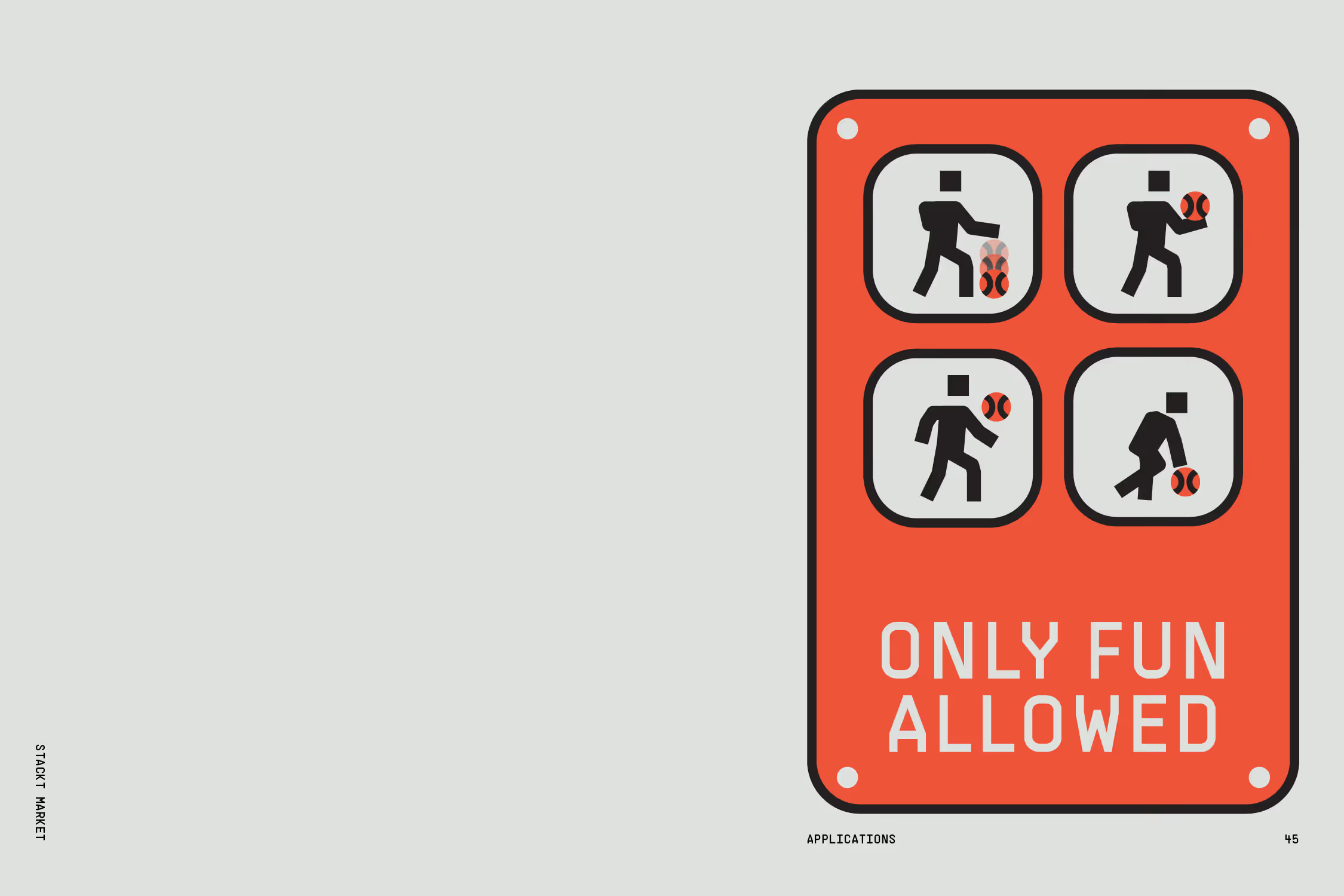
Wayfinding panel design for the basketball court in the Toronto flagship.
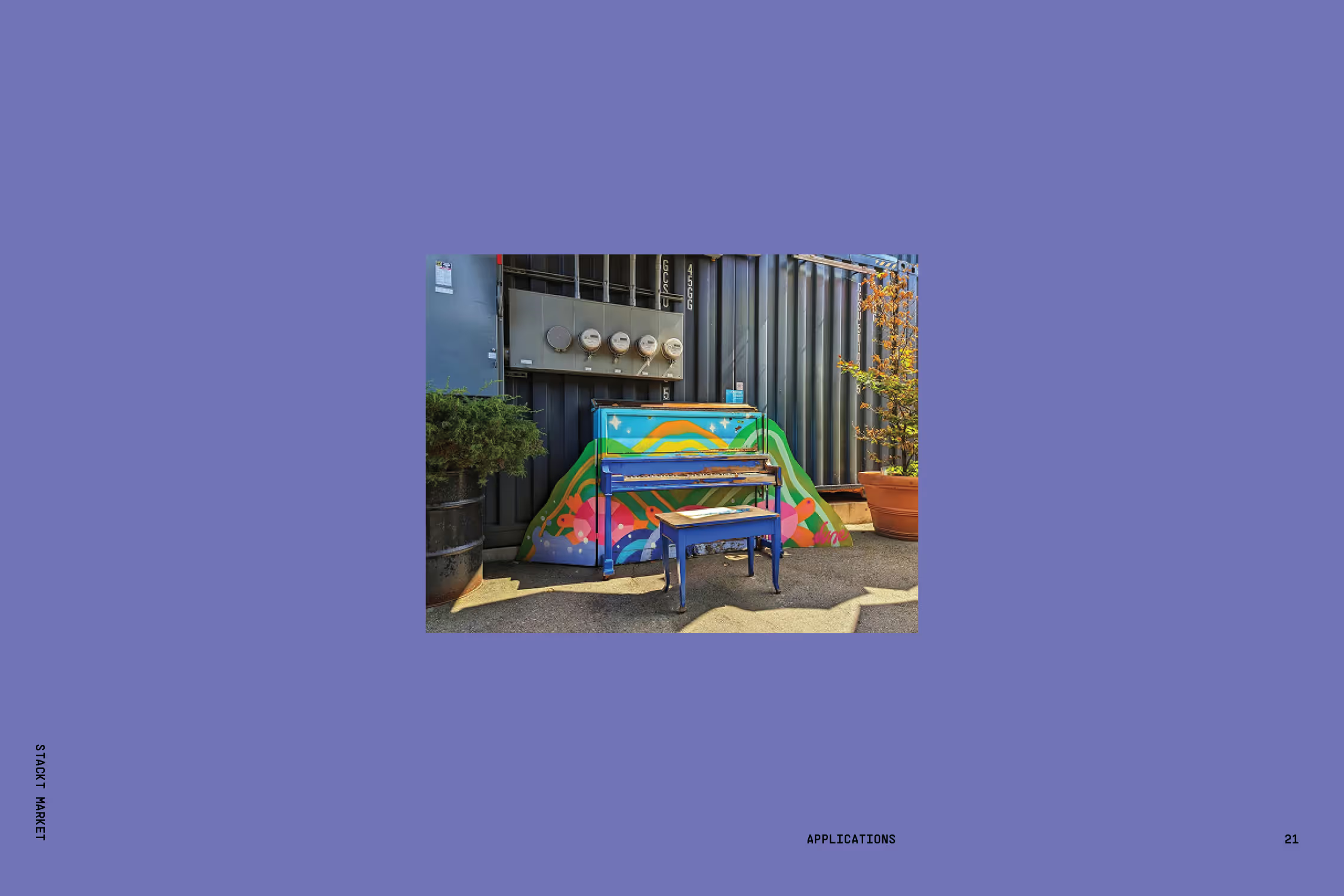
Piano installation in the original Stackt market.
Stacktx marketing campaign using adapting its original tagline to create a series of ads; Space for you turned into Space for founders, for builders and for creators.
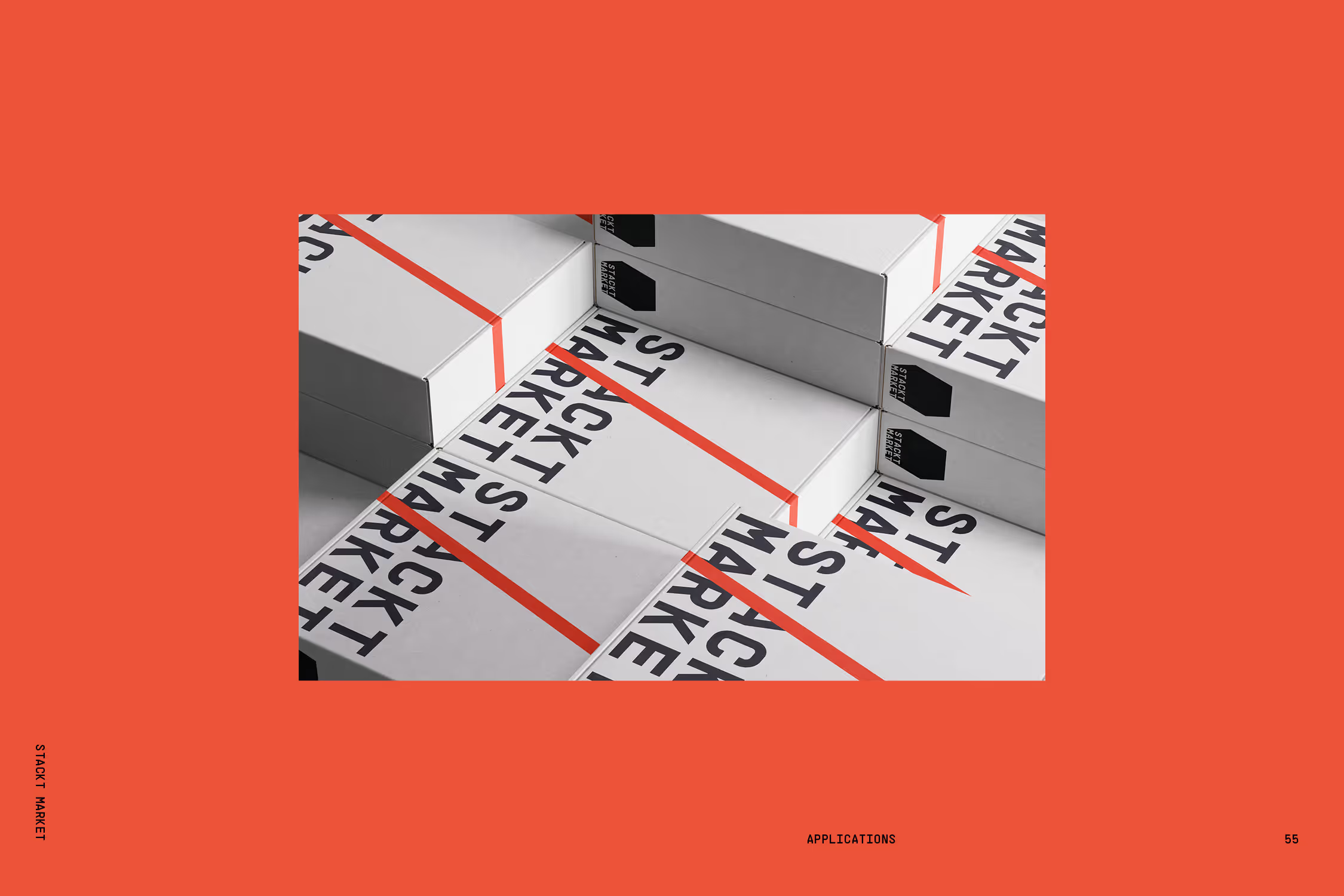
Stackt packaging.
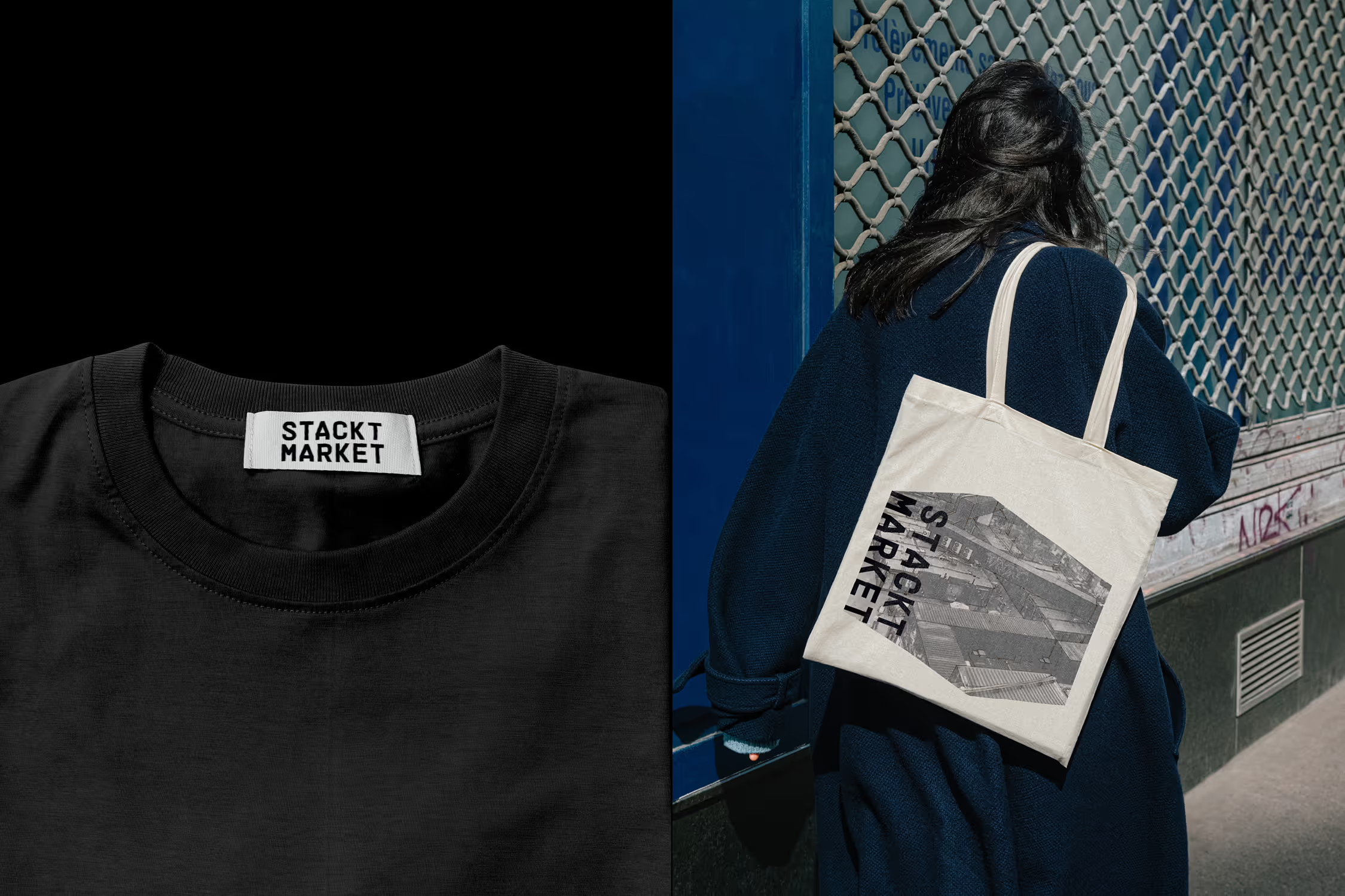
Tote bag and t-shirt merch.
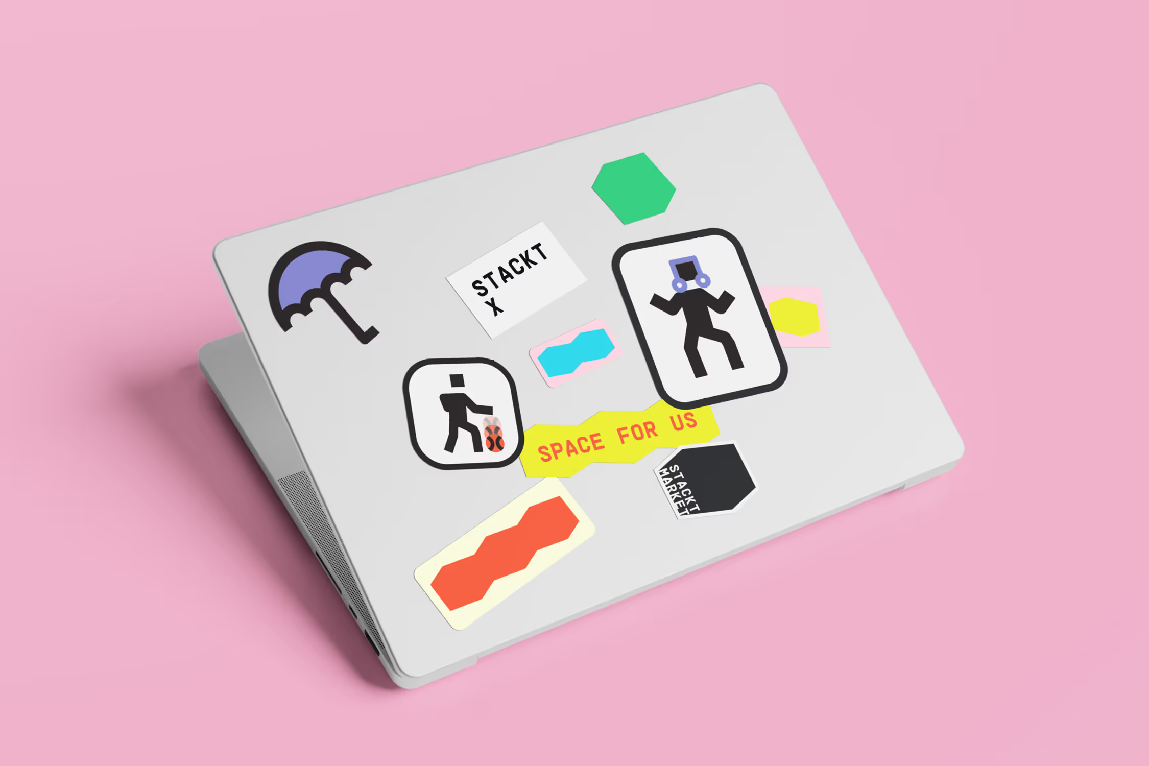
Brand stickers on the back of a laptop.
Stackt stationery communications system.
Stackt stationery postcards and notebook cover color variations.
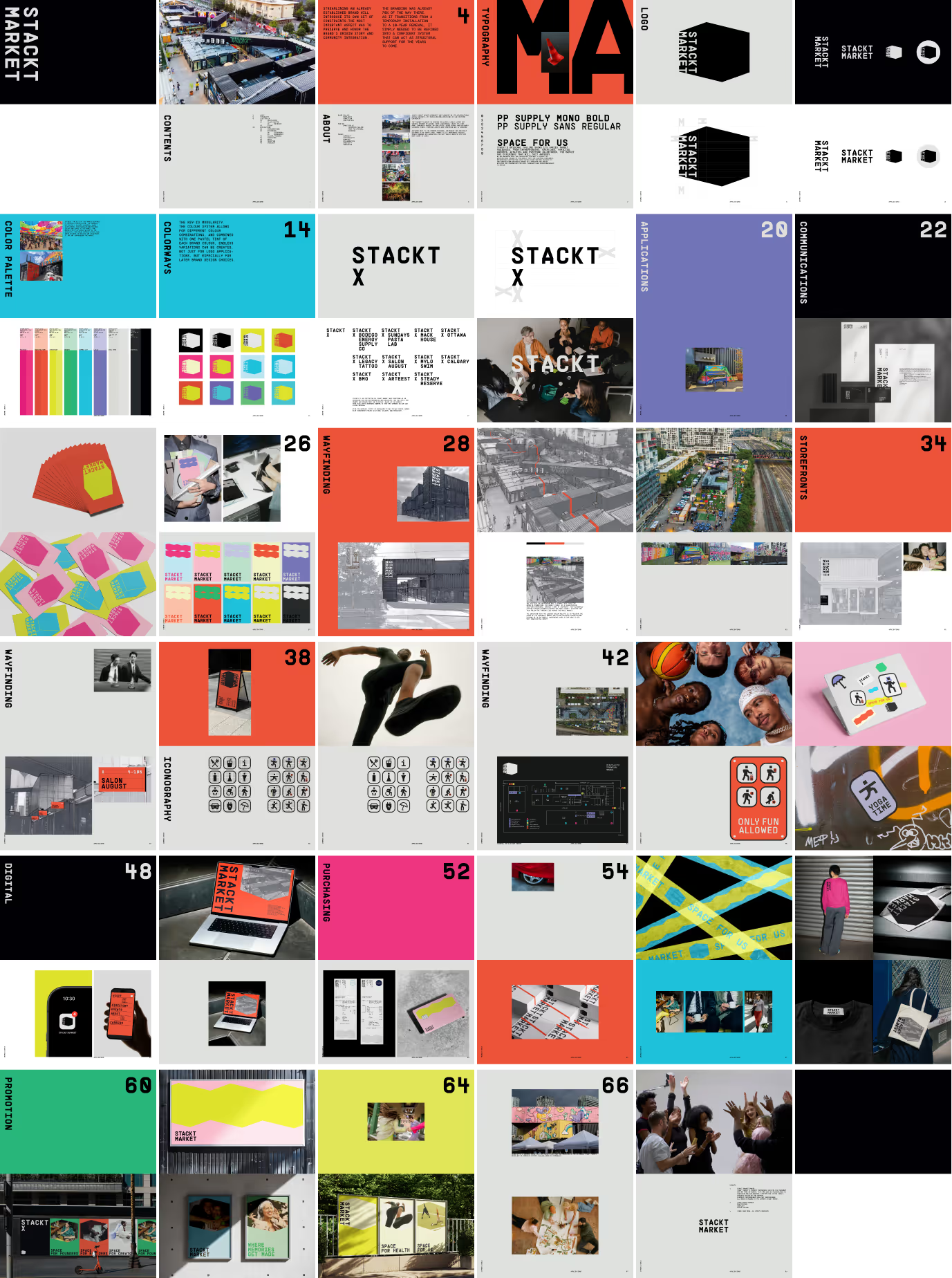
Collection of frames from the Stackt brand book.
Businesswoman holding a copy of a Stackt postcard.